
Self-portrait button by artist Pete Poplaski.
There were a few people I failed to interview for Will Eisner: A Spirited Life during the three years I researched it. Art Spiegelman and Frank Miller, for example, didn’t respond to multiple requests from me or friendly intermediaries. Harlan Ellison agreed then declined, which is a story unto itself.
And then there was Pete Poplaski.
Poplaski worked as an art director for Denis Kitchen at Krupp Comic Works/Kitchen Sink Press for almost 30 years. While there, he interacted often with Will Eisner and added his own artistic touch to numerous Eisner Spirit reproductions and graphic novels.
Fortunately for Poplaski – less so for me – he currently lives and paints in the south of France across the street from his long-time friend, legendary underground comix artist Robert Crumb. But Poplaski doesn’t have a phone. And he doesn’t use email.
I sent him a letter in care of Crumb, but never received a response.
“I did get your letter,” Poplaski told me this summer by phone from Massachusetts, where he was visiting Kitchen, “and I was going to respond, but at that time, I was working on something, and it got pushed back, and then I thought if I wanted to be in the book and I wanted to be quoted accurately, I should write it out, but when I write, I write faster on a computer than I can longhand, and I am a revisionist, and it would have taken too many drafts to get what I think would have been what you want, and then, I wouldn’t have been getting much work done. So I wanted to be in the book, and I wanted to contribute something, but then as I was working on other things and traveling around, it just got put aside, and then all of a sudden, Denis sends me a postcard, and your book is coming out.”
Poplaski is back in Eisner’s orbit this year, helping with cover designs for W.W. Norton’s new editions of the Contract With God Trilogy and Will Eisner’s New York. He’s also completing Eisner’s final instructional book, Expressive Anatomy, about which you’ll learn more below.
If you’re already familiar with Poplaski – the man and artist – you’ll find this an interesting look at not just his interactions with Will Eisner, Robert Crumb and Denis Kitchen, but his own life and work. And if, like me, you weren’t already that knowledgeable about Poplaski, this interview will be an entertaining riff with a man who has seen and experienced a great deal of comics – and comix – history.
|
|
|
BOB ANDELMAN: For folks who may know you from before but wondered how you dropped out of sight, so to speak, tell me a little bit about what you are doing now.
PETE POPLASKI: I live in the south of France, and I am working on paintings of landscapes and figure paintings and still lifes and things. Since 1994, so twelve years, I have been back and forth between Wisconsin and the south of France. In 1992, Denis Kitchen and I and Marty Beauchamp and Bob Chapman visited (Robert) Crumb in the south of France after he had a big exhibition, and we were talking, and I said, “Robert, what are you guys doing in the south of France? It’s my fantasy to live in Italy, actually, and work on paintings and drawings and things and develop my fine art kind of thing.” He said, Aline is a Francophile, and she loves France.” They had to get out of California because they didn’t want their little girl, Sophie, to turn into a Valley Girl, so they made the big transition to France.
Years earlier we had traded a little still life of mine for Robert’s four-page story, “The Short History of America.” I was the first owner of that for twelve years, but I had to sell it so I could pay when I went back to college in 1989. I was doing research for my Zorro book in California, and so I foolishly let those pages slip through my grasp. Otherwise, I would still have them, and they would be in traveling museum shows, no doubt.
ANDELMAN: I was going to say, probably an annuity there.
POPLASKI: It could have been, but at that time, when I sold them in 1991, the crest of the wave was just starting for Crumb, making him a national celebrity. I was working away on different art projects and trying to get a little extra money so I could develop my own book projects and do a little traveling, so I had no choice. It was either sell my Crumbs or sell my Prince Valiant.
ANDELMAN: And you kept the Prince Valiant?
POPLASKI: Well, I did, and it was probably a mistake, but you know, I can’t help it. I like Hal Foster and Milton Caniff, and I grew up liking those guys. I parted with some of my art collection at that time. I had a Steve Ditko page that I had to let go and some other things for survival’s sake, but at some point, it will all work its way out. Living in the south of France and going to dinner a lot with Robert, I have a lot of those little placemat drawings and things, so it’s not like I don’t have any Crumb art. “The Short History of America” is one of his masterpieces, and I was still mad that I didn’t own that any more when I did the R. Crumb Coffee Table Art Book for Kitchen Sink. And then when MQ Publications asked me to do The R. Crumb Handbook, then I thought, well, maybe I should probably start with “The Short History,” because it is one of his best pieces. I did that.
ANDELMAN: So you live in the south of France, living, apparently, in proximity to Crumb.
POPLASKI: Yes, I am living across the place from the Crumbs.
At one point, I got bumped flying to Paris, and I had to wait a day, so they gave me like $2,000 worth of free air vouchers, so I was flying back and forth from Wisconsin to Paris for free, and then I would land in Paris, and the Crumbs would let me use their Paris apartment, and I would walk around, and I would be standing there looking at a restaurant thinking, “Maybe I will have Turkish tonight.” I would look down at my feet, and there would be like two hundred francs on the ground somebody lost, so Paris paid for my first dinner. I said to myself, “It just feels like I am meant to be here.”
A mutual friend of ours from Angoulême, Jean-Pierre Mercier, came into his inheritance early, and he was visiting the Crumbs a lot at the same time I was. He said, “I come here so often, I think I might as well buy a house or something, then I will just have my own space, and I won’t have to be staying in the Crumbs’ guesthouse.” The Crumbs have a house that has like fifteen rooms, so we all kind of fit in there like happy campers, but at the same time, he just figured it would be a wise investment to pick up something, so he and Aline went walking around Sauvé, and they found this house that was built off an 11th century tower. The old guy who was selling it said he wanted $35,000 for it. Aline Crumb gasped and went, “Uhhh,” because it was so cheap! But the guy heard the gasp and said, “Okay, okay, it needs a new roof, so I will sell it to you for $25,000.” So Jean-Pierre bought the house really cheap, but he couldn’t really come, and he couldn’t stay there except for like three weeks in the summer and maybe one week over January, so he said, Pete, I know you need a studio. If you help fix this up and you pay for the water and the heat, you can have a place in the south of France.” So that was a great deal, I couldn’t turn that down. Later, I put $2,000 together, and I paid for central heating, so after I did that, he was so happy, he said, “You don’t have to pay any bills.” So I had a free house in the south of France.
So I have been just going along with that general attitude and developing my paintings. I have a couple of collectors, and periodically, they come down and visit the Crumbs. Aline loves all these still lifes that I paint, and she will come over and see one and say, “That’s mine, I want it, I’m buying it.” So I will make a couple grand, and that’s enough to float on for a while.
I am not trying to make a living so much as just have a little spending money and money for materials and things and then have enough money that I can go back and visit my family in Wisconsin.”
ANDELMAN: It sounds like you have a pretty good thing going there.
POPLASKI: I have always leaned in the direction of a fine artist, because I grew up with the idea of maybe being a cartoonist or commercial illustrator, but once I started studying fine art, I enjoyed that, and I got more involved with trying to do paintings and things. I think artists can break down into image makers and storytellers. The publishing industry is all in New York, the movie business is all in Hollywood, and in Wisconsin, I guess I could be a grade school teacher or a high school teacher, and I didn’t want to do that, so I dropped out of college the first time in 1972. But I had already met Denis, and I bankrupted his company basically the first time.
ANDELMAN: Oh, it was your fault.
POPLASKI: I did basically an unreadable comic book that was fairly visual, and because it was unreadable, it was ahead of its time.

ANDELMAN: What comic was that?
POPLASKI: That’s Quagmire Comics #1. Print magazine at the time did a special issue on comics. They took a couple pages from Quagmire #1, and they compared it to Richard Corbin and some other underground comic book artists who were doing very graphic things. I was interested in developing action scenes and page layouts and stuff. I would draw stuff thinking that at some point a story idea might gel, and it just never gelled, so I ended up with a lot of sketches and a lot of overdrawn comic book pages. I said to Denis, “I really love comics, but I really want to make art books.” At the time I said this, there were only a handful of books about comics available. There was a Maurice Horn book and a couple of old histories of cartoonists and that was it.
What I liked about working with Denis was that I could work on some commercial assignments and make some money. I could work on books by different cartoonists who I really admired, so it was a way for me to meet all my heroes. At one point, I had correspondence with Hal Foster and Al Capp, and I got to work with Will Eisner, and I got to work with Harvey Kurtzman, and I met Wally Wood and Bob Kane. I think I met everybody except maybe Frank Frazetta at one point or another in my ventures. I thought that was great.
I did a stint in 1980 working in the Marvel Comics bullpen just to see what that was like, and it was fun, but it was kind of a chore.
I also like to travel around and see art museums. When I dropped out of college, I thought, How am I going to continue my art education? I thought, well, all knowledge is in books, all the great paintings are in museums, I must go and see all the great works of art in their original form. Then I had to read all the books, like the letters by the artists, and then a history of the period, and then a romanticized biography to kind of get the gist of what all the stuff was. So that was always my background project when I was working for Denis, and then as I met Crumb, and as I met Will, and I worked on projects, that was all really kind of cool, too. And they respected me because I had this serious kind of academic approach, but I also respected comics as a serious expression, a serious medium that you could explore and develop visual ideas with.
|
|
|
ANDELMAN: Do you remember either your first introduction to Will Eisner’s work or your first contact with him?
POPLASKI: Like a lot of baby boomers, when Jules Feiffer’s The Great Comic Book Heroes was first abbreviated for Playboy, I happened to find that issue on the stands in 1965. My mother bought it for me and tore out the article, and of course, there was a great splash of The Spirit in the article, and I thought, “Man, this is really good. Who is this guy?” I loved the way that Feiffer wrote Eisner up and gave the background of the studio and how he was a kid who was erasing and sweeping up and arguing with Eisner about how to write and even signing Eisner’s name on the strip on occasion or filling in blacks. I thought, Wow, that’s really amazing. I wish I could do something like that. When the Feiffer book then came out, I got it as a Christmas gift.
When the Harvey comics came out, I bought those. Later on when I dropped out of college and moved to Milwaukee to work for Krupp Comix Works Denis’ new studio – it was May 12, 1972 — I just missed Crumb being there by a week! Crumb and Bob Armstrong and Al Dodge had come out to Milwaukee to record the River Blues Wisconsin Wiggle 78 rpm record that Denis made… This was the first 78 rpm record made in twenty years or something like that, and they had crashed at Denis’ studio the week before I was there. When I showed up, I basically took Crumb’s place on the couch.
Everybody was working out of Denis’ studio at one point, so a lot of people were coming through, like Jay Lynch and Kim Deitch and Bud Plant and some people who would come through on their way out driving out to the San Diego comic convention. One of the guys had twenty Prince Valiant originals and seventeen Alex Raymond Flash Gordon originals, so I got to really see the strips in their original form and hold them. That’s always an important thing for an artist to study and look at, line work and brush work that the masters have done so you can imagine how to do it.
The very first thing that came in the mail when I moved there, in like the second week in May, was this package from Will. It was the cover to Snarf Comics #3 with The Spirit confronting the underground comic scene. I was studying coloring overlays when I did Quagmire. Quagmire was pretty crude, and then for Snarf Comics #2, I think I did a back cover, and I refined the technique a little bit. When the Will thing came in, I was kind of nervous. Denis said, “Do you want to color this?” But I said, “Sure.” Will had supplied a colored pencil rough as a guide. I took one of these magnifiers that printers use, and I studied all the dot patterns on the Harvey comic edition trying to analyze what dot patterns made what colors. Then, by hand, I cut the red, blue and yellow overlays, and I also lettered in the logo, and that kind of stuff. It is fairly accurate to what the coloring is of the Harvey things, and I think some of those stories, or even most of them, might even have been colored by Jules Feiffer when he was doing assistant stuff with Will.
I thought the coloring on those was pretty good, and so I started learning different color techniques, and I started looking at other colorists — like Harvey Kurtzman, I think, was a good colorist — and some of the coloring in the Marvel Comics, especially some of the old monster comics, which is very simple but yet, because it is so simple, it has a very primary direct assault on your senses, that when they recolor, it just doesn’t have the strength of those simplified colors. It forced me to really study coloring and how moiré patterns work and different percentages of color so that you can really come up with some interesting effects.
So my first real coloring job for Krupp Comix was that Snarf #3 cover with The Spirit. Denis has it on the wall of his office in Massachusetts. It is amazing to see something from the beginning of my art studio relationship with Denis just so close at hand.

ANDELMAN: I believe we used that image in the biography, as well.
POPLASKI: It is always great to see the original art work. I was excited when Will and Denis made the deal to do The Spirit comics — and later, the magazines — because I wanted to read more Spirit stories. I was devoting myself to studying coloring techniques, analyzing dot patterns and stuff, for the job coloring the first Krupp Spirit comic wraparound covers. I hand-colored those. There are some pretty good coloring effects on that.
I believe the first time Will came through Milwaukee was at Christmastime to check the coloring on the first Spirit issue. I met him during his studio tour. Will was very interested in the whole operation. We discussioned some color revisions for The Spirit #1. I was getting ready to go to Florence, Italy. When I got back, they gave me Will’s comments on it, and then I made changes that he required.
ANDELMAN: Any of the comments stand out in memory?
POPLASKI: The staff would make a photocopy of the drawing, and then Will would, in blue pencil, write comments in the margin, and he would suggest things like, “Lighten this a little bit,” and “Darken this.” We were trying to make the coloring on The Spirit a bit more film noir by adding an extra gray plate to the black line art.
I collect old newspaper strips and studied the coloring in Flash Gordon, Jungle Jim, Prince Valiant, and Milton Caniff’s Terry and the Pirates and Steve Canyon. An important color element was the adding of gray, which made a rich kind of maroon color or midnight blue. I tried to color the Spirit a little bit more toward that range to underscore the drama, because we felt it would help re-introduce the seriousness of the character and the type of atmosphere that pervaded Will’s work.
Will usually did a color pencil rough on a photocopy, and I still have those someplace, with little comments and stuff. Sometimes he would give me a special color that he wanted, like solid blue with a 30% red in it or something, but what he was most focused on whenever we did any of these colors were the white highlights. How he would pull the figure out of space would be the back lighting, where you get the figure of the Spirit and you get the white lighting effect down half the body or something. So that was the most focused, most specific item in his coloring suggestions and guides is where to put the highlights, because as in any old master drawing classic technique with Watteau or Reubens, for example, is you might have a color paper, like a light green or blue, and then you might rough out the figure in red, and then you make your corrections in brown, but then to focus the eye, they go for the accents, which are the blackest blacks and the whitest whites. Will’s focus on all the covers and stuff was always where the whitest whites were and where some of the dark spots were for dramatic effect.
|
|
|
ANDELMAN: Listening to you talk about this that knowing that Will himself was quite a production guy, he must have appreciated your attention and understanding of the detail.
POPLASKI: I would quote and show him things I was studying, which he had respect for, like some of those Terry and the Pirates color pages. I always worked on The Spirit covers and the Steve Canyon covers like they were art prints. It had to read from a distance. That was very important, and Will liked to hear that, because we all understood how the marketplace is cluttered with titles. So how do you get the customer’s attention? How do you pull in the potential audience that’s out there? Oddly enough, Will’s biggest critic of his book cover designs was Harvey Kurtzman, who told Denis not to let Will design the final cover. Kurtzman felt Eisner’s genius was in writing and drawing but not in the packaging of his own work. Kurtzman felt Will wasn’t inspired by this chore and had a mechanical approach that didn’t reflect the content of the work.
The philosophy that Will and I discussed and worked up for The Spirit and I carried it over into the Milton Caniff titles and things worked, because I got a couple of offers to Hollywood to work in animation, because John Kricfalusi, for instance, came in and called me twice to offer me some sort of position working in coloring the Beanie & Cecil cartoons and the Ren & Stimpy cartoons. I just didn’t know anything about that particular field to think that I would be successful in it, and I thought I would just be better off going back to college and getting a degree and focusing on my own painting, so that’s what I did. Of course, Kricfalusi later on got let go because he was late on his projects, and somebody else took it over.
ANDELMAN: You could have saved his butt.
POPLASKI: I don’t think I would have added… because I try to do the definitive version. All I ever tried to do when I worked on a Will project or a Caniff project or any of these guys I love, Kurtzman, whatever I tried to do, I tried to make them look as serious and as good an artist as they are. I always thought, This has got to be the definitive version. So that’s why some of the projects I have been involved in, people liked the Superman or Batman covers because I have tried to give them the classic figure while also showing how the original character evolved a little bit. It has to have a graphic quality that you could see from a distance. When I did the Superman book series for DC, I thought, How can I do Superman where it is any different from the million artists that have already done Superman? And since Superman is a larger than life character, the only way I could do this is, I decided to draw the covers like five feet long. So I made Superman larger than you are supposed to, because one of the things that bothered me about comics — and what I really loved when I saw the originals by Will or The Spirit — was the size of the work. You are a little bit freer, and so Will had this looseness and an animated quality to his figures and stuff that was phenomenal, and part of it was because he was drawing big, and then the art was reduced for the comic book. Later, he could draw at any size and keep those qualities.
ANDELMAN: Over the years, comic books might have been kind of frustrating for you because they are, as Jerry Iger would say to Will, “It’s a sausage factory; we’re just pumping them out.” But it sounds like your attention to detail, you probably are more suited to fine arts. You sound like someone who wants to spend more time on each piece.
POPLASKI: I am not a guy who cares to repeat himself. The thing about doing a landscape is you can do the same landscape while you are standing in one place, but the wind blows, the lighting changes, the season changes everything, and every day, it’s a new struggle, and I enjoy that kind of struggle. When you have to turn out comics — I was just part of the Marvel assembly line when I worked there in 1980. I had a friend, Mark Gruenwald, who died in 1996, and I would say to him, “What do you have in the files that you want finished?” And he would say, “Here’s a Spider-Man story. We are going to use this for What If…?, and it’s incomplete marker drawings by Gil Kane. Can you fix it up and finish it?” So I did, What If…? #30, which is “What If Gwen Stacy Wasn’t Killed by the Green Goblin?” I finished that one up, and then I worked on a Thor, because they were behind on Thor, so I worked on Thor299. Then I did a couple of pin-ups for them. I inked Carmine Infantino on a Ghost Rider pin-up. It was fun to do that, because I liked hanging around the bullpen and hearing stories about different artists who would come in and drop stuff off. I got to meet Steve Ditko and Jack Kirby and all these guys going in and out. It was a thrill, but I wasn’t just doing comics while I was in New York, I was actually working for my brother on West 80th Street, doing drawings of the cityscape and drawing Central Park. I had paintings I was working on while completing inventory for Marvel Comics.
I should have tried it at DC, but at the time I went to DC, the office atmosphere was different. You would walk into the DC office, and it was very solemn and quiet, and it could have been an insurance company or something. At Marvel Comics, we were just acting like knuckleheads. Jim Shooter would open the back door for us, we would all sneak in, we would work all day, then we would take a break and go play volleyball in the park and then come back and do other stuff. It was really wacky and fun in that respect, working in the Marvel bullpen at that period.
I was thinking I was going to stay in New York and try to continue both careers, one working in the comics and the other one trying to get some kind of body of work together for galleries. But then Denis Kitchen got married, and I had a cousin that got married, and they were both on the same day, so I had to take the train back to Wisconsin to be in both weddings. Once I got back to Wisconsin, I was broke, so I just stayed there. That’s basically me… I just go with the flow. It depends on what my own personal work is involving.
|
|
|
ANDELMAN: Are you married?
POPLASKI: No. One of the reasons why I am not married, I have had several girlfriends I have been serious about. I have a charming sweetheart right now who is a very good painter. She is Flemish, and she is from the south of France, and we just had an exhibition together at the University of Wisconsin, in Oshkosh. We just did a big tour of America, you might say, practically, because we were looking at other possibilities for continuing the exhibition, maybe in Chicago, maybe in Boston. We were looking at galleries in New York last week. It’s a continuing adventure.

Artist Pete Poplaski painting his hero, Zorro – dressed as his hero!
ANDELMAN: I figured to be able to “go with the flow,” you probably were not married.
POPLASKI: Yeah, right. The thing is, if I was married, my programming is all from the ‘50s. It’s Zorro and Superman and The Lone Ranger, and you know, once you make a commitment, you know, the Lone Ranger never breaks his word. Another thing that always amazed me was that Will always made every deadline he ever had, and — Denis Kitchen will vouch for this — I miss practically all my deadlines. Actually, I have met a few of them, so I really can’t claim that I have screwed up every doggone job I ever did, but I have come in under the wire a lot, which drives publishers crazy, of course, but it’s usually because I am just slower. Everything is approached like it is a definitive work or serious work of art, and there is no hacking it out. So though I have tried, I just can’t quite do it.
ANDELMAN: Let’s go back to when you joined Denis Kitchen in Wisconsin.
POPLASKI: I was in Wisconsin at Kitchen Sink Press. At that time, actually, it was Krupp Comic Works. They published the first two Spirits.
I am trying to think of the first time I met Will. I can’t remember if it was on the East Coast. It probably was when he came out to talk to Denis about continuing the Spirit in magazine format. I just picked up doing that just like we had never stopped doing the underground comic book, so we continued the magazine, and I think Will came out, and I got to meet him. We talked about all kinds of things art-related and comic-related.
ANDELMAN: When you were in Wisconsin, living at Kitchen’s place, and Will came out for a visit, was that when Cat Yronwode was also living there?
POPLASKI: That might be the first time that I met Will, actually. That would have been around 1979, 1980, probably 1979. It was during the summer; Cat was there with Denis McFarling, and we were assembling The Art of Will Eisner. Will made an appearance. I think he had a mustache then, too. We had a great time. Again, he was telling all these stories that later on he drew, and Cat was there, and she was egging him on to tell certain stories, and he would, and it was great. So he was there, and once the book was more or less put together and practically ready to go to the printer, she wrapped up her end of the stuff, and we agreed on where everything fell together, and then they bought a jukebox and put it in the back of the truck and drove away.
|
|
|
ANDELMAN: You probably had your first dinner with Will on that visit.
POPLASKI: Probably. I was very respectful, and it was a thrill to finally meet Will.
When we did the second Spirit, I hand-cut the zip-a-tone for the four Spirit stories, because the difference between the first underground and the second underground it was decided to add gray tones on the interior guts of the second issue. Just reprinting Spirit stories from Will’s archives in the black and white stat form didn’t seem to have enough graphic punch. Will drew The Spirit for color and after the first issue it was decided to add gray tints to increase the sense of space and drama. Instead of cash I asked for a page from Will and I received the new wash page with The Spirit and a Wonder Man sort of character. The first new page he did for the new Spirit comic.
Instead of getting paid cash to do it, I said, “I would rather just take an original,” so Will gave me one of the first new Spirit pages he had done, which is the big title page, a panel where Spirit talks to Wonder Man, who decides to go back to professional football. That’s like the first new page, and it’s really beautiful, and I received that in the mail from Will for doing a good job on correcting all the gray tones and stuff. So that’s from the second issue.
That cover on the second one is, that was actually printed in-house. We were trying to save some money. We actually had a printing machine in the office, and Tyler Lantzy, who was the business manager, printed the covers on that, and then we shipped the covers to the printer, and they put it on the book, but that’s why it was a matte cover and not an enamel stock, traditional comic cover like the first one was. Again, that was just when the underground comic market was taking a dip, and we thought we could save some money if we printed the covers in-house. So there was a series of covers that had a dull matte finish as opposed to the enamel stock cover, and the second Spirit is like that. But it’s got some pretty good coloring on it that I did with zipatone overlay, but it has a little fill-in on the stripes of the kneeling Turk or whatever, and that is because Tyler Lantzy shot the negs and developed it right in-house. It might have been a little better if he would have sent it to Port Publications, which did all the prep comic work printing at that time in Port Washington, Wisconsin. They did a lot of yacht books and boat books, right on Lake Michigan.
ANDELMAN: When do you cross paths with Eisner again?
POPLASKI: I met him probably the second time when he came out for The Art of Will Eisner in 1979 or 1980.
When we were starting to reprint all the post-war Spirit stories, I was in New York visiting my brother, so I got together with Will at the School of Visual Arts, and I sat in on one of his classes. It was a very interesting discussion about how to run two plot lines at the same time. He also had me talk to the class about how underground comic book publishing worked and how to create your sample. At that point, I was also looking at samples of people who might be good draftsmen or might have a good comic that Kitchen Sink Press might want to print. I would sometimes be part of the team that would go to comics conventions, and rather than have Denis be bothered by all kinds of people with portfolios, I would take them all aside and look at them from the point of view of fine art and stuff like that or critique them in terms of comic strips. I was really well read as far as what was happening in the comics world, and I could discuss how people could improve their portfolios. There might have been one or two guys out of all those hours of looking at portfolios that ever finally came through and were published by Kitchen Sink Press, but there were a few.
|
|
|
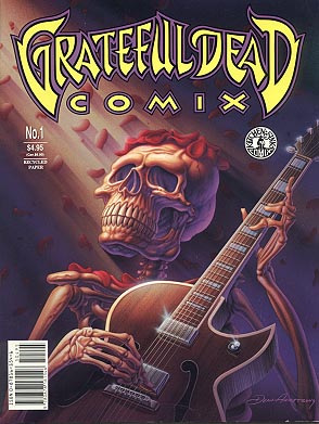
ANDELMAN: Do you remember any?
POPLASKI: Well, one was the guy who did some covers for the Grateful Dead comic series that we did. I think his last name is Armstrong. He came with a portfolio to the Chicago Comics Convention, and I saw it and recommended him highly to Denis
I accompanied Will to an Upper West Side comic book store on another occasion because he had to do a book signing. I met him up there, and he was up there signing some of the first issues of The Spirit comic book, I guess. I had been assigned to be like an art designer, because Will didn’t even have time to re-read the stories. He said, “You know what sells, you know what excites people about The Spirit, so read the stories, and work out some ideas for what would make good covers, and then I will just draw them.”
ANDELMAN: That’s trust.
POPLASKI: And so I, of course, went through and found specific poses that I liked. I would do a big mock-up, then we photocopied it and sent it to him, and then he put velum over it and totally redid it. And he gave me the vellum drawing, so I have the first cover to the Spirit comic, which is fun, because I have the photocopy as well of the drawing that I did that he then totally revamped.
I went through a few stories, and I think it was the issue that had the “Stop the Plot” story, which is now on exhibition with the touring Masters of Comic Art exhibition. I would say, “Will, here’s this window that you drew, and we have the Spirit looking out. That will be a good cover; it actually has a dimensional quality, because the cover is a window, and the Spirit is sticking his head out the window.” And I was giving him all kinds of real specific kinds of things. Will wanted some basic ideas and stuff, but he didn’t want to copy anybody, and the phrase that he hit me with was that rather than just being an art director saying, “Will, I want you to draw this, and we need this by 5:00,” he said, “When you speak to me, speak in fundamentals.” So I had to stand back for a minute, and I said, “Okay, I need a rationale as to why this would be a good, exciting scene based on the number of stories that we are showing, that were in that particular issue, and how this would work as far as all the covers in a row would look.” And we never did do the window cover! But from that point of view, I gave him a choice of different images from different stories, or I tried to combine them a little bit, that maybe he would want to use that as a springboard.
That was one of the key phrases of my working relationship with Will, when speaking to him or working with him, I had to work from the point of view of fundamentals, and then he could build on that, or that might inspire him to take a totally different direction.
I worked with him on his graphic novels as well, doing the cover for A Life Force. I did thirteen or fourteen cover designs for that just to show him what was possible, different styles, different city scenes. I had two or three that I liked a lot, and then a lot of them were just similar ideas but not as developed. That one, we were talking about his background with the Yiddish theater, and I went to the opera a lot when I went to New York because my brother was working with the opera, so I would sit there and study these sets and the lighting. I saw some particular opera, and then I was trying to see if that would work with something to show Will’s new cast of characters, so the original cover of A Life Force, which is kind of a brown cover and have all the characters in blue, that was actually a stage effect that I saw on the New York City Opera stage. The way I got Will to go along with it was, I was going back to his background with the Yiddish theater and his dad painting sets and all that stuff, and the idea that this isn’t the Spirit, this is a new cast of characters. They were all kind of mysterious, and the light is going to come up, and you are going to get a whole new Eisner story. And he went with that idea, so he created that wraparound cover. I always thought in terms of wraparound covers because it simplified the idea instead of having a leftover back cover.
I also worked on cover ideas for the City People Sketchbook. That was another one where I did a whole pile of drawings and different type styles, and the idea of the red ink kind of figures in the background with Will in front in levels, because I always try to work in levels. When I was coloring The Spirit comic, he asked me why I was doing certain colors, and I told him it was to create depth. I usually had two formats. There is a warm version where you work with red, brown, and black, and you develop a warm dimensional quality, and then there was the other one, which is where you go blue, and then you go purple, and then you go black, and that’s the three levels that give you some sense of space, and he liked that. It worked out very well, and sometimes we experimented with painting grays. I would paint a 20 percent graytone, and then they would photograph that, and then they would print that as a color, and unfortunately, that seemed to get condensed a lot, so in some of the early Spirit covers, the color got too heavy. The trouble was, usually, when we were doing these color grade things that were hand-painted, I could modify it a little bit, but no matter what I modified, it still didn’t seem to make it light enough for the printer, so I started lightening the palette again a little bit.
I hand-colored the first thirty Spirit comic book covers, and then Ray Fehrenbach took over, because I got tied up going back to school. I was really getting burned out on getting these plastic overlays with the dot patterns. I really started cringing. I thought, if I have to do this any more, I am just going to run away.
ANDELMAN: The thrill was gone.
POPLASKI: The thrill was gone, and you know, I was feeling like I was in a factory situation, because we were always running late on everything we did, and I was always doing all-nighters. When you are young, and I was in my thirties, so I could still do it, but it was not exciting any more. A comic book would come out, and I really liked what I did, but it was just, I needed some time to do other things. And I started working on the Caniff magazine, and I started editing text, and that was another whole thing, because, again, it was pushing toward making art books rather than just drawing comics or being a technician.
|
|
|
ANDELMAN: Did working that closely with Will have an effect on your art, because obviously you were so close up with what he did?
POPLASKI: Earlier in my comic career, I wanted to emulate more of the Hal Foster sort of thing, and as I got away from doing comics, I tried to emulate Will a little bit, because when he came and we worked on the Spirit Jam for instance, he actually sat down and knocked out a couple of pages right in front of us. I was sitting there drawing him draw his comic strips, and there is a little drawing — it is in the book Kitchen Sink Press: The First 25 Years — that I did which was just a profile of him, basically. It’s him at the drawing board inking that last page with Denis and Cat and Iger Diamond. He did those pages while we were in the office, so we sat around joking, and he was telling stories, but I was watching how he held a brush, how vertical he had it, how much he thinned it with water and stuff, how he would draw or re-draw the dark side of a figure as opposed to just blocking it in. And again, the funny thing is, once the pages were done and we went to dinner, I think in the final analysis, when he looked at all the pages, I thik he went back and re-drew a lot of it, because it was maybe a little too spontaneous. I had a discussion with him about portraiture, and he said, “You know, I have never been good at portraiture. That really takes a whole different way of looking; I am more of an impressionist. “
ANDELMAN: That’s interesting.
POPLASKI: As he said, “impressionist,” and he was drawing these figures and blocking in the calligraphy of his brushwork, it was a perfect demonstration of that.
ANDELMAN: Now, as close up as you got to see him work and got to see his work, could you find fault in any of his work? Were there things where you went, you know, it might have been a little lazy there, or…
POPLASKI: Will always met his deadlines, which meant sometimes he probably didn’t have time to do his homework. There is a Spirit cover that he did with The Spirit wrestling an alligator, and he sent it in finished, and I looked at it and said, “This is the worst alligator I ever saw.” It looked like a log. He didn’t even think or bother all that much about anatomy and some of the form, and so Denis called him up and said, Will, this cover doesn’t quite work. Pete thinks the legs are too stubby.” We gave him a very thorough critique on it, and he said thanks. We sent it back, and he re-drew it.

Neil Gaiman sketched by artist Pete Poplaski.

Todd McFarlane sketched by artist Pete Poplaski.
ANDELMAN: There is a story in the biography about how when I Denis and Dave Schreiner started working with Will, they were kind of hesitant to give him direct feedback, because, God, he’s Will Eisner. Did you ever go through any of that yourself, where you were kind of holding back a little bit?
POPLASKI: No, because being an artist myself and talking to student artists all the time, working with other people, I am very respectful of where they are coming from. I did the same thing with a Mark Schultz cover. Mark Schultz did one of his early Xenozoic Tales; it’s an underwater scene, and I said, “The poor guy, he’s really a great draftsman, and he’s working hard, but he has this kneecap all screwed up. If anybody really knows anatomy and looks at this, they will think he is not doing his homework or he rushed it or something.” We pointed this out to Mark, and he said thanks, and he changed the whole leg around, and it looked a lot better, and that was that. I felt that part of my job as an art director working with Will or working with anybody is respect what they did, but if it really bothered me, I spoke up.
ANDELMAN: What was Will’s importance to Kitchen Sink Press over the years? When he was not in the office, how was his work and his being a part of the organization viewed by the staff?
POPLASKI: I always thought of Will as “Uncle Will.” I worked so close with Caniff, I thought of Caniff as “Uncle Milt.” I think it comes back to watching too many “Mouseketeer” shows. Will could be like Walt Disney walking in and being real friendly and chummy with the kids and telling them a story or showing them how to do something, and we were always ready to learn something, and we were always amazed at some of these stories. We were cut off from the world, in the middle of Wisconsin, and he was telling us about Jack Kirby throwing gangsters out of his studio in 1938. We thought that was great, geez. Everybody loved it when Will showed up. When we had done the second Spirit comic, he and his brother Pete came out, and I had all these figure paintings that I had done. Pete came into my office and saw what I was working on. He had a daughter who was studying art, and then he noticed that I had a Spirit cover pinned to the wall. I said, “Yeah, it’s really great working with your brother. I am really inspired by his artwork.” He said, “Oh, you are inspired by Will’s artwork?” Then Will came into my office, and Pete said to him, “Will, Pete’s really inspired by your work. You should give him this cover.” So Will is like, “Oh, okay,” and he signed it, “To Pete, my pal, good coloring support! Will Eisner.” But then he went, “Help, Denis! I am giving away original artwork!” So I owe Pete a debt of gratitude, because I have covers one and two of the Spirit comics from that. For a while I had it hanging up in Europe because that’s one of the originals that I can put in my suitcase and take over, and then if I come back and I want to change some of my art collection around, I bring it back. That was a particularly good Will Eisner visit.
ANDELMAN: I would say so.
POPLASKI: That was a major moments in my life when I was working with Will.
As I started working with the Caniff book projects, I was going to New York, and interviewing Milt in person, and he was taking me around the city. Because Milt worked in Tudor City with Noel Sickles at one point in his career and Will worked in Tudor City in New York, I thought I would go and take photographs of some of these places. Joe Simon and Jack Kirby had a studio in Tudor City, too, so I thought, what kind of magical apartment building is this that these great cartoonists all have studios there? I went and took pictures of that in case I could use them in any of the publications we were doing.
What was also fun was that I got to talk to Will on and off when we were editing all the “Shop Talk” interviews. Dave Schreiner edited a couple of them, and then he was working on something else, so I edited them. I made copies of Will’s tapes, and I would play them over and over again, like a radio show or something. If I had to work late at night, I might as well as have the old masters giving me all their good stories and stuff. I would listen to Will do his interviews and stuff, and then I was the one who had to run out and try to find illustrations to work with the interview. Most of the pictures in the Shop Talk book, that’s all my research to get stuff to fill up the magazine.
|
|
|
ANDELMAN: Let me ask you about Shop Talk. As part of this interview series, I talked to Howard Chaykin, and he said that one of the points over the years when he lost respect for Will was the “Shop Talk” interviews. He said that Gil Kane, who was interviewed in one of them, had complained bitterly to him that Will had changed his questions to Kane’s responses and that Kane — and then Chaykin — found that offensive. Can you speak to that?
POPLASKI: I would have loved to call Gil Kane back and go over it with him, but the truth is, I didn’t do the Gil Kane interview. I was very scrupulous about keeping everything accurate and clear and certainly not trying to change questions to make anybody sound bad. Will wanted everybody to have their moment, share the spotlight. The idea, of course, was to have a sense of camaraderie. When you are working in the studio and you discuss art and stuff, you get ideas for how to expand your work. Noel Sickles and Milton Caniff shared a studio, and that changed Caniff’s drawing style totally.
I am sorry that Chaykin felt that way, but Will didn’t change anything in that interview. We tried to give everybody the best possible representation. I can only think Gil didn’t remember it correctly, and it’s too bad he bad-mouthed Will about it.
ANDELMAN: I am glad I got to ask about it, though.
POPLASKI: I had dinner with Gil Kane on a couple of occasions when he was in Chicago at those conventions and heard a lot of the stories, and I don’t know what offended him. I don’t know where it got wrong, where he thought it went wrong.
I want the story straight. There weren’t that many magazines that were doing that, and then after he started doing it, then you had Interview magazine come out with everybody getting interviewed, and you know, The Comics Journal did a lot of interviews, and that was good. But an artist-to-artist thing is different from a fan talking to an artist. So that was always a plus.
I forgot to say this earlier, but before I even met Will, and before I moved to Milwaukee, I went to Europe twice, the first time with the University of Wisconsin at Green Bay. I was studying all the original Michelangelos and Donnatello and Boticellis and Leonardo, and they all knocked me out, but then when I went to the Italian newsstands, there was a magazine called Eureka, and it reprinted all the pre-war Spirits in black and white. I spent all my money buying art books and Will’s reprints in Italian. It was the only way to see other stories from the early ‘40s, and they were amazing. Later on, working on covers, following in the footsteps of Jules Feiffer, I actually got to sign his name. The “Will Eisner” signature on The Art of Will Eisner, that’s me copying his signature. I had to do it best. I had to do it at least as good as Jules.
ANDELMAN: Didn’t you recently work on the cover for the the Contract With God Trilogy?
POPLASKI: Yeah. What happened was, I didn’t design that cover, but Denis had trouble with what they put together, and so I looked at it, and I went back to what their source material. I suggested a different color motif, adding a background and putting a perspective or something to it to make it look more Eisner-ish. They didn’t have his name correct as far as having it in a perspective or having it large enough for who he was. I thought they wanted it immediately, so while I didn’t change their configuration of the figures, I didn’t think they were chosen very well. I tried to work Eisner-esque lettering around them, and then I did a watercolor. Well, the art guys at W.W. Norton took the watercolor, and they printed a whole series of colors with them. Denis saw this and said, “This is not Will’s work.”
Anyway, that was the story with that cover, so I had to revise it, and then for the second book coming out, I totally designed a wrap-around cover, which I guess they are going to do, and hopefully the color will work out. I did a watercolor for them but let them know it’s a suggestion.
ANDELMAN: Which book is the next trilogy? Is it New York?
POPLASKI: Yeah: Will Eisner’s New York. I did the cover design and the color design for that.
ANDELMAN: Now, are you the new Mike Ploog, drawing in the Eisner style, or are you just doing design?
POPLASKI: No, no. What I do is I work with collages. I take all kinds of photocopies. In the old days, we had a stat camera, and I would take the original artwork by Will or by Milton Caniff, and I would stat them in various sizes and create a collage that looks like a new original. Especially on a cover, I would never want to try to draw an Eisner fake because that’s not what the public wants, you know? I think you can take a detail from one of his drawings and blow it up, and it will be very strong, and you color it right, and it is like an Eisner cover. No one has any place trying to fake Will’s stuff for a cover.

Artist Pete Poplaski drew the cover of Will Eisner’s The Spirit:
The New Adventures for Kitchen Sink Press.
ANDELMAN: Were you still at Kitchen Sink when it published Will Eisner’s The Spirit: The New Adventures?
POPLASKI: Yeah. I did a cover. I wanted it to really look like a 1940s comic, so I emulated something that Will and Lou Fine did. It’s like, I want to say Marvel Mystery, but it can’t be Marvel Mystery, it has to be some other thing. Will did some science fiction covers in the 1940s and some monster-type covers for Quality Comics. I did the third or fourth cover or something, which is these zombies coming out of the ground, pulling Ellen Dolan in the grave, and The Spirit was smacking a couple of them. I was trying to emulate Eisner’s early style. I figured I’ll go back, this will be a retro look, because everybody was doing the new look, and Will would pencil the covers, and they would get somebody like William Stout to ink it and stuff. To me, it had a little bit of a coloring book quality. So when they said, “Pete, do one.” I said, “Okay,” and then I tried to get the pre-war Spirit on the cover rather than The New Adventures. I am just old-fashioned.
ANDELMAN: Once you started commuting to Paris in the 1990s, then living there, did you have any continuing relationship with Will?
POPLASKI: No, not really. Once I was over there, because I was so close to the Crumbs, what I was doing for Denis was all Crumb-related material then. I designed three R. Crumb calendars. The Mr. Natural Postcard Book is one of the projects we put together. I was working with Robert the same way I worked with Will. In other words, they said, “Crumb, do you want to do a calendar?” He said, “Okay,” and, “Pete, go pick the images.” For a twelve-month calendar, I would go and pick twenty-four images, do twice as many, then they would pick twelve, and then the next year they would want to do another one. I would pick up the file and pick twenty-four other ones, and then once they pick them, we draw them in color. A lot of them, I would do color roughs, and then Crumb would okay it and suggest changes, and then I would do the whole thing and send it in, and that’s that. Because I was living across the platz from Crumb, it was easier to do Crumb-related projects rather than Eisner projects. Because I don’t have a phone, they have to call Crumb, and Crumb has to run down the street to get me. That used to happen a lot.
ANDELMAN: You still have no phone?
POPLASKI: Yeah, I still don’t have a phone. My girlfriend has a phone, so you can call my girlfriend, and I will call you back or something, but it was always tricky getting ahold of me because I was there, just living as minimally as possible and just focused on drawing and painting…
Crumb wanted me to do this second book, because he trusts my judgment as far as choosing all the images and trying to tie him in with his text, stuff that I learned from playing with the “Shop Talk” interviews that Will did. I really didn’t want to do an interview book because what bothers me about things like The Comics Journal interviews and stuff that I used to collect and read, half of it was the interviewer cracking jokes and reacting to the artist, and I would always skip over that stuff. When I was working with Caniff, I didn’t feel I was that important to the reader, so why even put me in? So I took that all out, and I wanted to somehow have Caniff connect directly with the reader. It’s like what happened with “Shop Talk” where you got Will talking to Caniff or Jack Kirby, and it’s like you are in the studio with him. I liked that quality, the idea of the artist coming right out of the page at you. That’s the way I worked with Crumb.
However, on this last book, because we weren’t just doing a biography, which we did in the first book, we were trying to talk more about being an artist, about how the world treated and all this kind of stuff. There was a lot of re-writing after I did all these interviews, and plus, I was working from quotes. If he said something wacky or goofy while we were having dinner, I would write it down, and then I had like a page of about fifty quotes, and I was trying to work these quotes in as springboards to get him to comment on different things. It was really complicated. Again, he was working on his own project, and he said, “I don’t want to be bothered. You know what I would say. Just write it in.” So I would, and then he would look at it, and he would say, “I didn’t say this,” and he would tear it up. So it was a good comedy routine. You can’t put words in these guys’ mouths, but you have to find the topics that get them going. That’s the trick.
|
|
|
ANDELMAN: How did you hear about Will’s passing?
POPLASKI: I think I called Denis just to say hi and to touch base, because I usually try to call up when I am going to come to America, and the problem with that was, I was broke, and I was stuck in Europe, because I was working on the Crumb book, and the publisher wasn’t coming across with the advance money.
ANDELMAN: Oh, I know what that’s like.
POPLASKI: It was horrible. So anyway, I called him up just to say Merry Christmas, how are things going? And he said, “You might want to send Will a get-well card, he’s in the hospital. He is having a heart operation.” I said, “Yikes, yeah. I gotta send something to him.” And then not too long later, I got a call from Denis who said, “I just want to let you know Will died.” It was sad, because he was a tough guy, and I didn’t think whatever he was having, a quadruple bypass, so many people seem to go through that stuff pretty good, and he was, it sounded like he was ready to go back to work, and they had to fight him to keep him from working. So that’s how I found out. I was going to send him a get-well card or a Christmas card, and then I got the news that he had passed away. It was sad.
ANDELMAN: And here you are, drawn back in. It’s kind of like the mafia.
POPLASKI: And again, I am trying to be totally faithful to his spirit, so to speak. I am going through boxes of drawings for his Expressive Anatomy book, and I am trying to find all kinds of images and things from his various graphic novels that can work with this, and then whatever pencil sketches that are clear enough that they don’t need too much tampering with, we will try to work that in, as well. It’s amazing… there I was thirty years ago, when we started bringing back The Spirit, and now here I am, wrapping up his career.
ANDELMAN: What can you tell us about Expressive Anatomy?
POPLASKI: It’s the logical extension of the first two books he wrote which are the manuals of how to do comics, the breakdown of it. With Will, it’s interesting, because he was more of an impressionist, but yet he was trying to give the reader or the future artist or cartoonist who is studying this, trying to give an idea of how important gesture is, and again, it’s really a theatrical analysis, a breakdown. It goes back to delsartian gestures and all this stuff and how to set up comedy and how to set up suspense and stuff by the expression of the figure. It’s not all Burne Hogarth’s dynamics, anatomy and muscles. There is a little bit of that stuff, but it gets back into, how are you trying to express something through the figures? Because I think nowadays, there are a lot of people who self-publish, so you can be as crude or you can be as slick as you want to be. There is such a wide range of what comics can be now, and of course, with Will, the more you understand how the figure works and the more you can adapt from real life, looking hard, the better your stories are going to be. And of course, again, that all translates into maybe even doing longer stories or more important graphic novels, because right now, there are a lot of graphic novels. I don’t know what the rating is.
|
|
|
ANDELMAN: How far along was Expressive Anatomy when you got your hands on it?
POPLASKI: Will developed it to a point of it is like 126 pages, I think, or something, and the other books come at 160 pages, so the problem is, what can we find in Will’s background that falls right into place with this book? Yesterday, we pulled out the box, and I said, “What this needs is, ‘Hamlet on the Rooftop.’” And “Hamlet on the Rooftop” is a real good example of what this book is about, because Will did this piece that was in The Spirit #29, and it’s like a street guy on a rooftop who does the whole Hamlet soliloquy. The whole Hamlet thing is translated and updated. I think it is very effective and a very good demonstration about how you can pace things and how you can court things and then how the figure is used and dramatic lighting. It has everything. So that’s from my first going through the book and figuring out what we need to pull from Will’s background that fits in. That will probably be in it.
ANDELMAN: If you don’t have a phone, I am guessing you are not online, either.
POPLASKI: Right. I’m one of the last guys. Because I am working on this Eisner project and I am doing another sketch book of my own background, and I have been working on a big Zorro project for years, for which I have gathered six hundred images, and it’s time to try to make the dummy.
ANDELMAN: I saw that on Denis Kitchen’s website.
POPLASKI: Yeah. There are parts of that on there, but mostly it’s me jumping out of windows in my Zorro costume.


The legendary swashbuckler Zorro painted by artist Pete Poplaski.
January 27, 2007 at 4:24 am
Hey, Cousin Pete! Many thanks for sharing this interview with us. I always knew you were a passionnate guy, but I had no idea about the intensity in which you had evolved in the world of comics and it’s icons. I am proud to own many of your works and I will use them to inspire Paolo to continue his dream of becoming a Comic Book Artist! Can’t wait to see you and Rika again. We’ll have the Lemoncello ready! Love, “Cute Boat”
April 9, 2007 at 2:54 pm
Pete & Rika Sent this along to add to the interview:
AMIGOS!
TO SEE PETE POPLASKI’S LATEST ADVENTURE… GO TO http://WWW.MYNAMEISBILL.COM AND
CLICK ON THE DATE APRIL 5, “BECOME YOUR HERO”. IT’S ALL OUT ACTION IN SAUVE
AT MIDNIGHT.
ADIOS!
We invite you to look at the following sites; myself and Peter Poplaski as
artist and as Zorro.
http://blog.seniorennet.be/deryckerepoplaski
http://www.bergenstreet.com
http://www.mynameisbill.com
Cordialement vôtre.
Rika Deryckere ( Amie de Zorro )