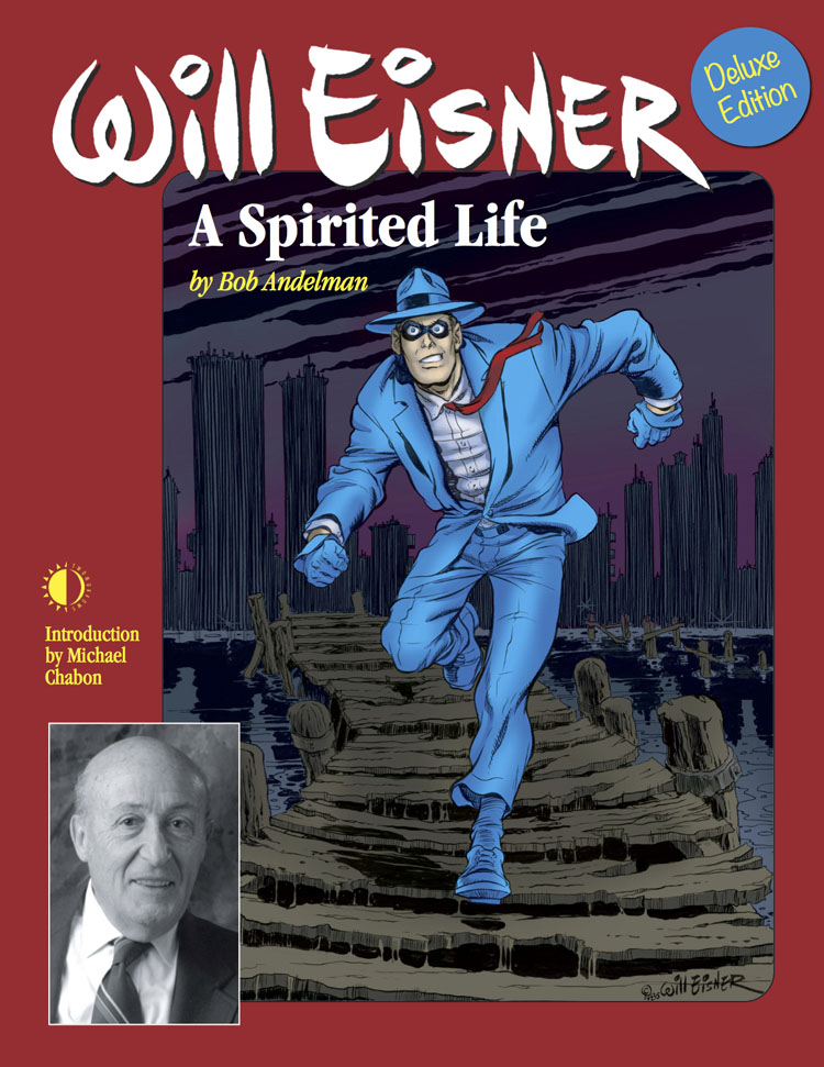
 Image via Wikipedia
Excerpt from column by by Augie De Blieck Jr.:
“The best cartoonists know exaggeration. That’s true of animation, where stretch and squash is the term given to how an object or character moves in an exaggerated style to better sell a motion. In comics, that exaggeration keeps the pages looking natural and fluid. Redrawing stock poses exactly as they are in a photo is not just lazy (or, perhaps, self-defeating), but also results in a final page that looks stiff. Will Eisner drew characters who had their joints and muscles in the right place, but who would overact, stand with a slight bend in their knees, and have a more iconic look that didn’t try to convince you they were real. They were only real in your heads because Eisner told the story so well, through both words and pen-and-ink. It looked natural on the page because Eisner’s lines were loose enough to throw enough energy on the page to make you feel that way. If Eisner chained himself to the drawing board and didn’t quit until every possible line in every drawing he ever did looked exactly lifelike and realistic, we wouldn’t have had half his graphic novels, and they would all look stale, anyway.”
Related articles by Zemanta
- Graphic NYC Honors Will Eisner Week (aspiritedlife.com)
- Will Eisner: The Spirit of Comics (NYCGraphicsNovelists.com) (aspiritedlife.com)
- ‘Rhymes With Orange’ cartoonist Hilary Price remembers Will Eisner (aspiritedlife.com)
- Will Eisner Week 2010 (WillEisner.com) (aspiritedlife.com)
- First Amherst, Then Main Street (Loose Cruse; Howard Cruse) (aspiritedlife.com)
- Will Eisner: Photo-illustration by Seth Kushner (aspiritedlife.com)
- GeekDad Interviews Comic Book Artist and Writer Dave Beaty (Wired) (aspiritedlife.com)
![Reblog this post [with Zemanta]](http://img.zemanta.com/reblog_b.png?x-id=6044e81e-2dff-47d9-be79-344f8421c507)
